THE PROCESS
1
Research
For the research phase of the project I used the following methods: Usability Tests, Depth Interviews and Online Surveys
I determined my target market by sending a survey screener across social media, interviewing a select few about their venue experiences, and gleaning mobile payment insight from the following sources:
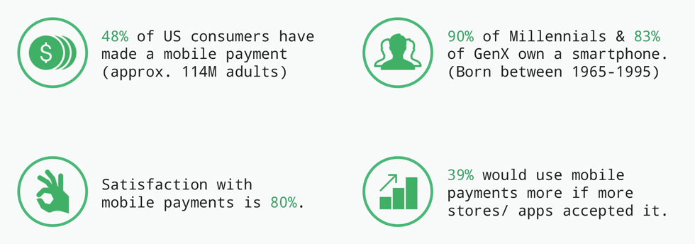
Data gleaned from mobile payment reports.
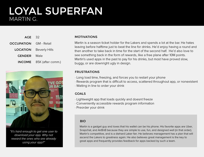
Personas
I organized my data by creating personas that I could refer back to throughout the design process ensuring that I was designing for essential user needs and goals and to reduce the risk of feature bloat in my products.
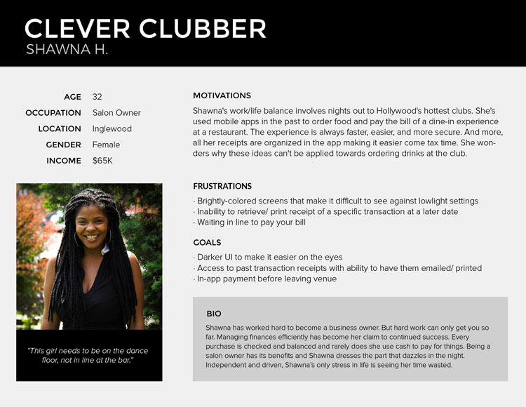 User personas reflecting the data from the research 01
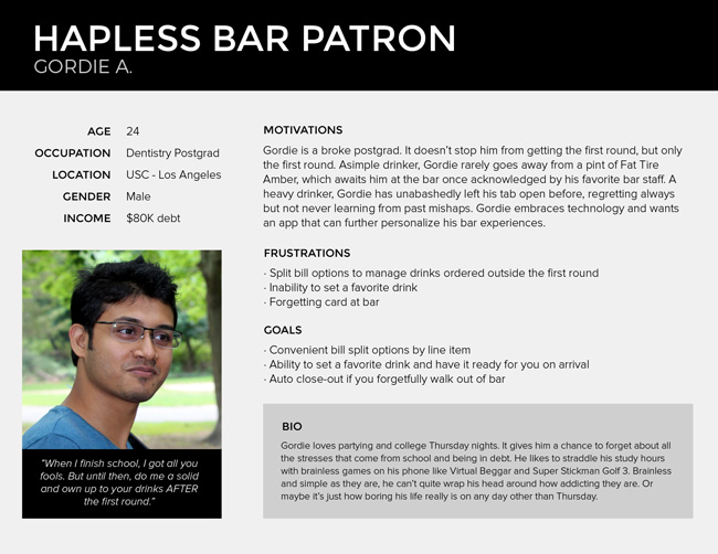 User personas reflecting the data from the research 02
 User personas reflecting the data from the research 03
THE PROCESS
2
Analysis - Features
My interviews revealed that respondents wanted quick access to venues and their order menus. Users were frustrated with apps built with too many extra features. Feature bloat created mental havoc for the user and pulled the focus away from these primary users needs.
Users wanted a simpler way to select drinks and submit their order. Respondents had trouble reading through lengthy drink menus. Small buttons and text made it difficult to add drinks and review the order before submission and brightly-backlit screens were harsh on the eyes.
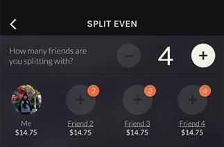
Users also wanted better explanation and flexibility in how they could split bills with friends in a group. Splitting a bill was a primary feature of competitor apps, but the process confused the user or the app didn’t offer an option to split the bill by line item (Velocity app).
The following features would be implemented into the mobile app:
- Easy sign-on and login
- Easily add friends or guests to split a tab or bill.
- Easily order drinks and split a tab or bill.
- Have more than one drink order at a time.
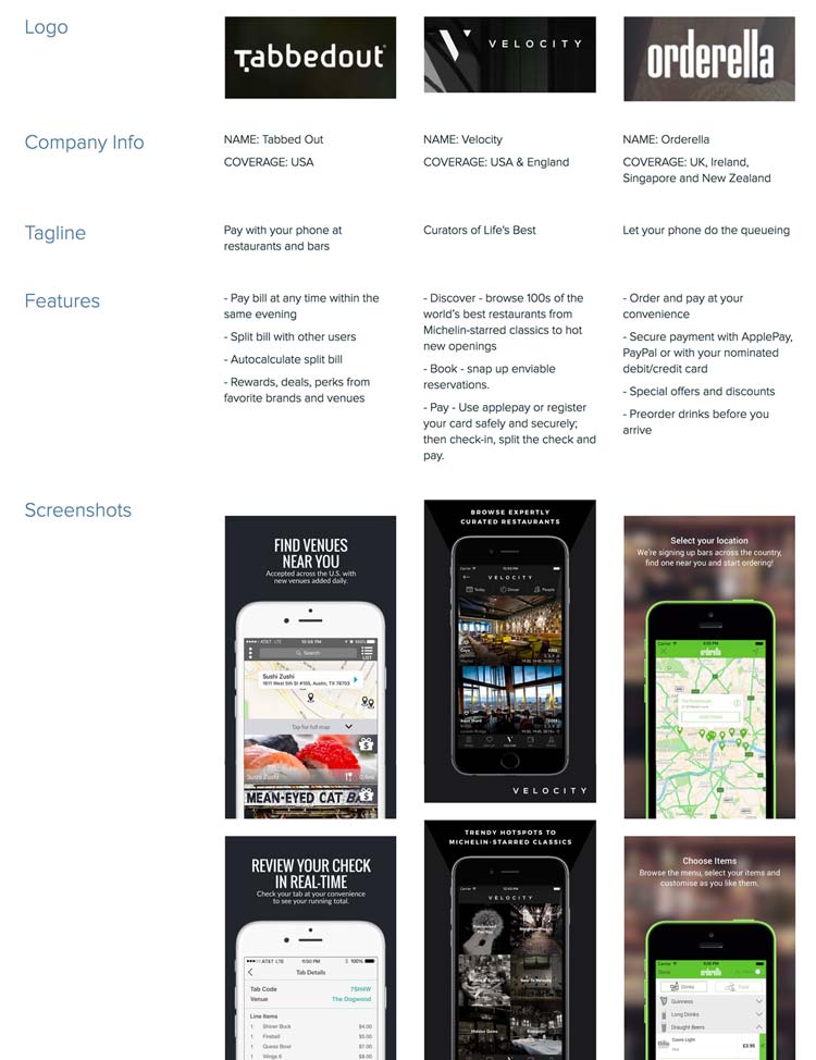
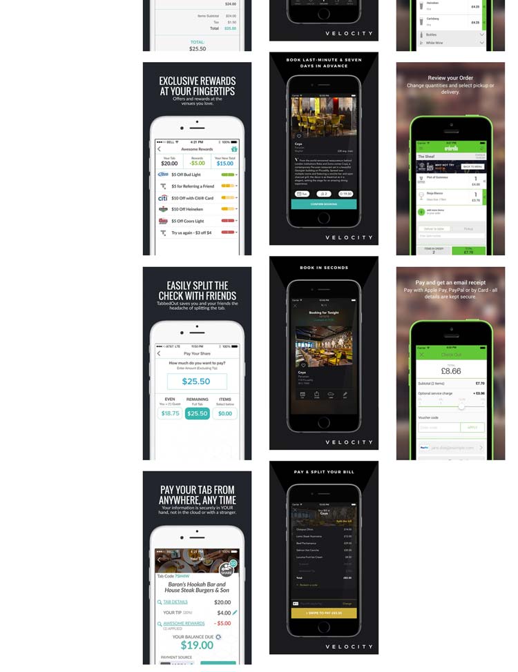
Competitor Research - Benchmarking
In addition to user research, I created a competitor analysis of the following apps: Tabbed Out, Velocity, and Orderella. Tabbed Out highlighted user incentives through their loyalty/ rewards program, but the UI was inconsistent — color of the menu bar and use of the color blue, requiring the user to learn new representations for tasks. Orderella suffered from similar inconsistencies. However, it utilized an onboarding experience to explain its key features, answering popular questions and increasing confidence of a potential user. Velocity had the most appealing and delightful design. But it also had the most feature bloat of the three competitors and limited itself to four- and five-star venues that were “hard-to-reserve.”
I decided to strip out the best features from each app that would solve the needs of my users and incorporate them into my product designs.
After poring through all the data, I concluded that the products would be designed with the following features:
- The ability to search for nearby venues
- Discovery by geolocation - nearby participating establishments
- Drink pre-order notification based on menus of participating establishments
- In-app checkout
- Real-time order tracking
- Split-tab calculator
- Auto-closeout based on geolocation
- Auto-applied promo codes
- Tip preset for minimum gratuities
- Preferred-drink preset
- Discount / Perks / Rewards (DPR)
THE PROCESS
3
Design
My design process would include User Stories and a Flow Diagram
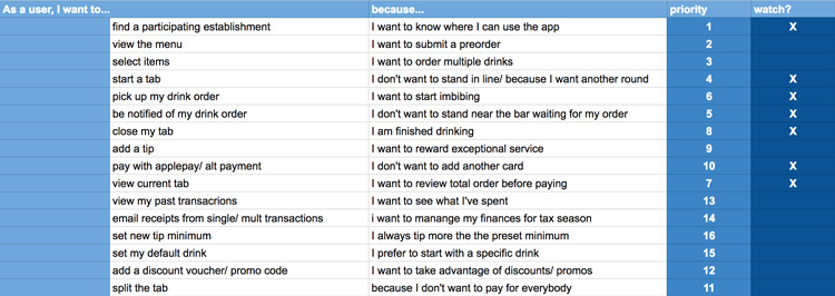
User Stories
Based on the motivations in my user stories, I generated a list of user personas to help define the main tasks of users.
I then created user flows in Sketch to break down the complex user stories and visualize the paths of action users take to achieve their goals.
This stage of the design process was critical in identifying the areas of cognitive overload and redundancies.
 User Stories
User Flow
Next step in my design process was to define the navigation style that I thought would accommodate the users flow through the app. Here I could call upon my earlier research and mobile app experience.
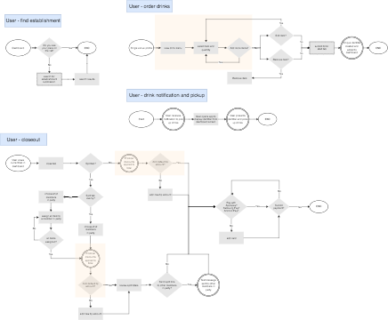 User Flow Diagram - Navigation
THE PROCESS
4 and 5
Prototype and Design
In creating my wireframes, I focused on reducing confusion of the entire application, balancing the amount of content, visual balance, and user-friendly UI. To reach these goals, I stripped away extraneous features users were less interested in.
In my user flows, I recognized areas where the flows could be simplified through automation. Automating secondary actions would provide a more delightful and seamless experience for the user. Areas benefiting from automation included the promo-discount application and default tip amount in the User-closeout flow.
Branding
Simultaneously, I began designing the brand identity and visual design systems.
The logo is built up using three visual concepts representing the following brand attributes: Personal, time sensitive, and effortless. The result is a strong, balanced mark that is recognizable at any size.
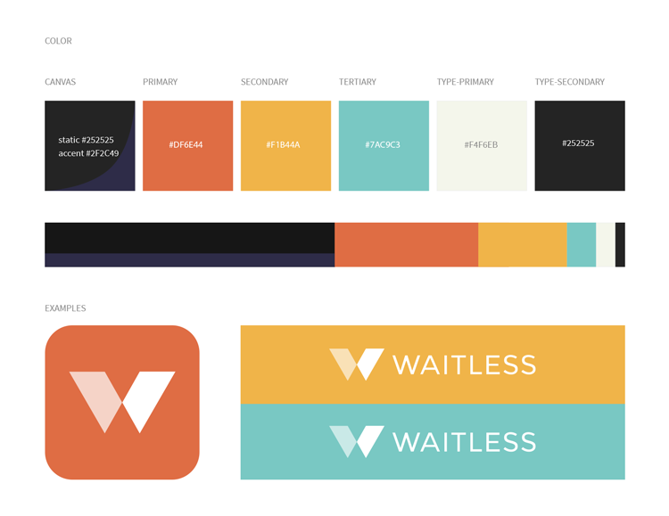
The color system is fresh, inviting, and lively. The palette is inspired by the idea of a group of young professionals enjoying a fun night out.
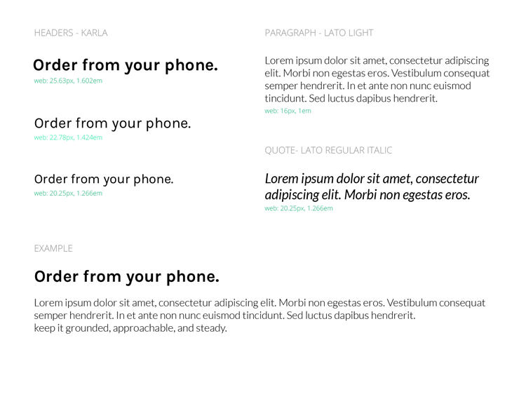
My type system uses Karla for headlines and Lato for body content. Karla has a quirky professionalism, a duality that resembles the modern spirit of the working world. Lato is modern and its light weight makes it easier for the user to navigate through a venue’s drink menu.
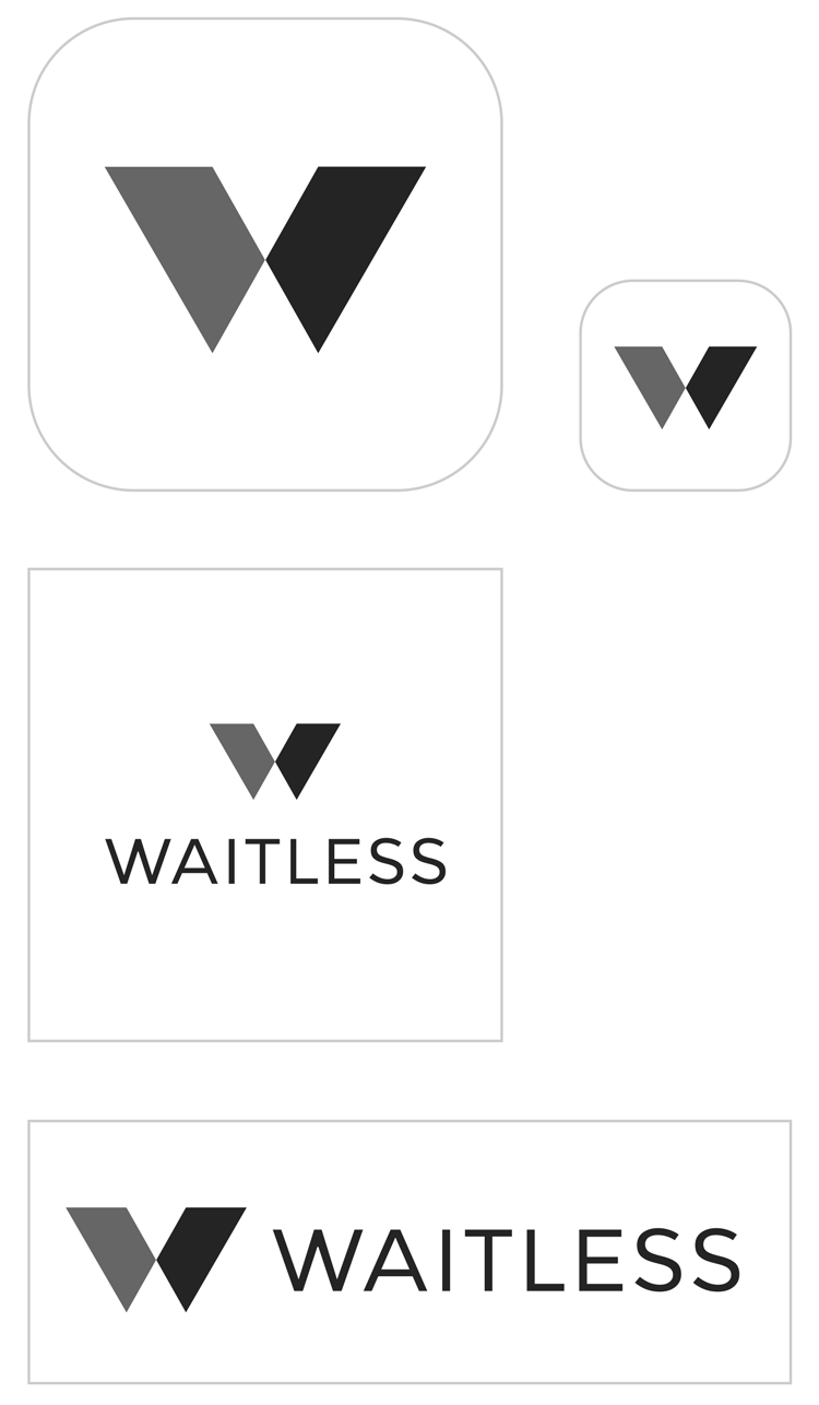 Identity mark on white - light backgrounds
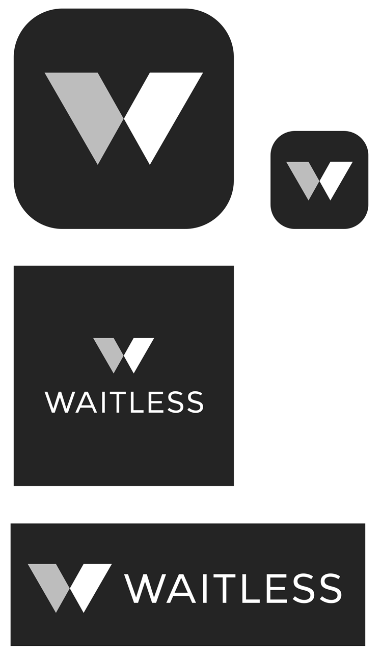 Alternate mark on dark backgrounds
 Visual Systems
 Color Palette, type Scale
Wireframes and Design
For this project, I used Sketch for the wireframes and design.
In creating my wireframes, I focused on reducing confusion of the entire application, balancing the amount of content, visual balance, and user-friendly UI. To reach these goals, I stripped away extraneous features users were less interested in.
In my user flows, I recognized areas where the flows could be simplified through automation. Automating secondary actions would provide a more delightful and seamless experience for the user. Areas benefiting from automation included the promo-discount application and default tip amount in the User-closeout flow.
 Lo-fi Wireframe
 Hi-fi Mockup
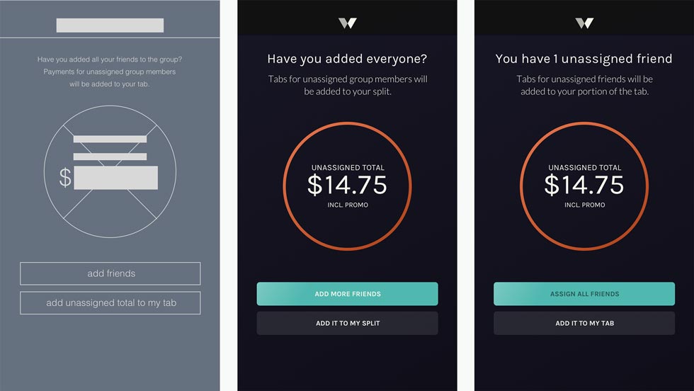
More Testing
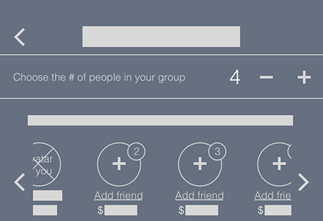
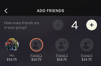
I conducted a user test on my lo-fi wireframes and received invaluable feedback in areas of the process that I had blindly overlooked. Users, particularly those with Android devices, disliked my current labeling system for unassigned friends and informed me how that system was typically reserved for message notifications. My solution was to remove this system and replace the avatar placeholder icon with one that was more semantic.
 Lo-fi Mockup
 Hi-fi Original
 Hi-fi Final
Iterations of the labeling system for unassigned friend profiles
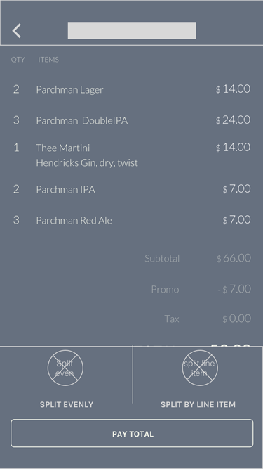
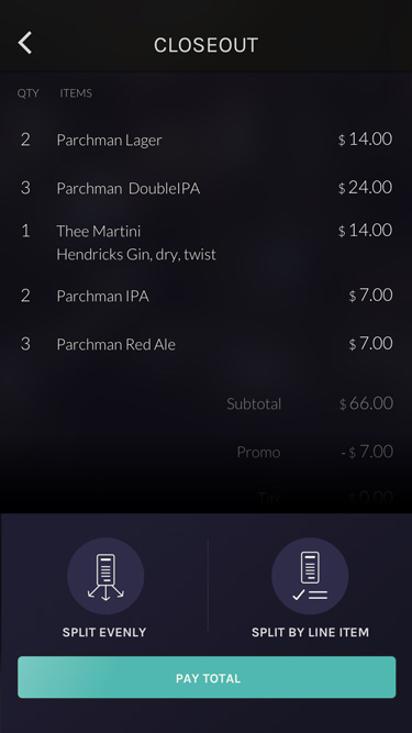
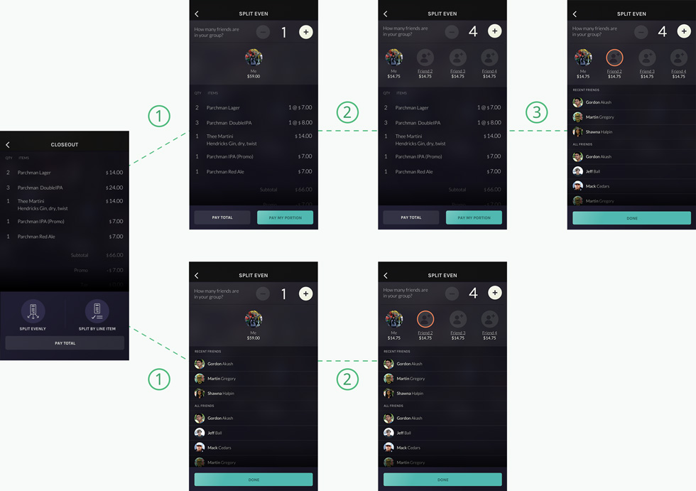
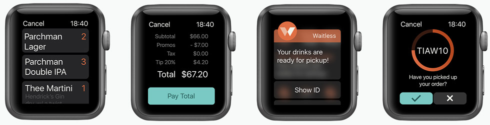
Payment Process
Payment process (split by line item): Original flow (top), final iteration (bottom)
 Payment Process - Lo-fi and Hi-fi
Venues - Card Content
For the venues, I leveraged Usability Hub’s Preference Test feature and tested card content layouts to help me finalize a solution. Users appreciated the larger image because they could ‘see’ the venue. I took this feedback and made the image a focal point of the cards in my list view.
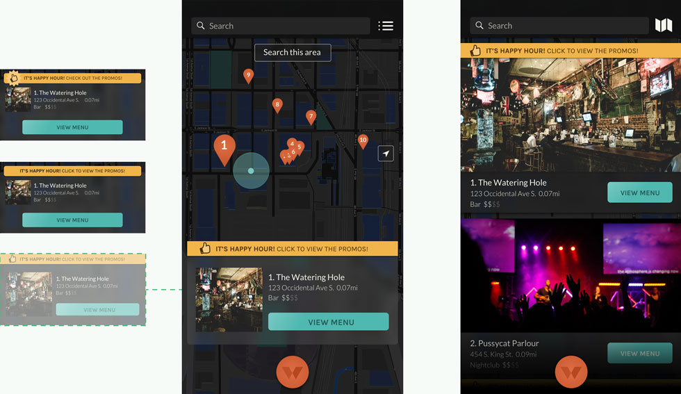 From left: card content layouts, discovery screen (map view) with preferred card design, discovery screen (list view)
Menu Items
I also explored the presentation of menu item options focusing on space and button size. I reduced the opacity of option buttons to direct the user’s attention towards adding the drink to the order. Button sizes were increased for users to scan, understand, and take action.
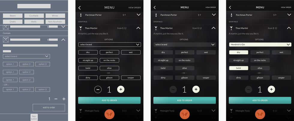 Single menu item expanded to display options (from left): lo-fi wireframe, hi-fi mockup (original), hi-fi mockup (final iteration), hi-fi-mockup (final iteration) with options selected.
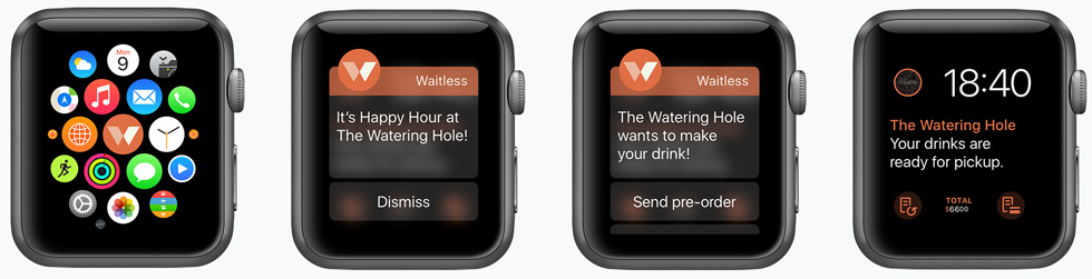
Apple’s Human Interface Guidelines
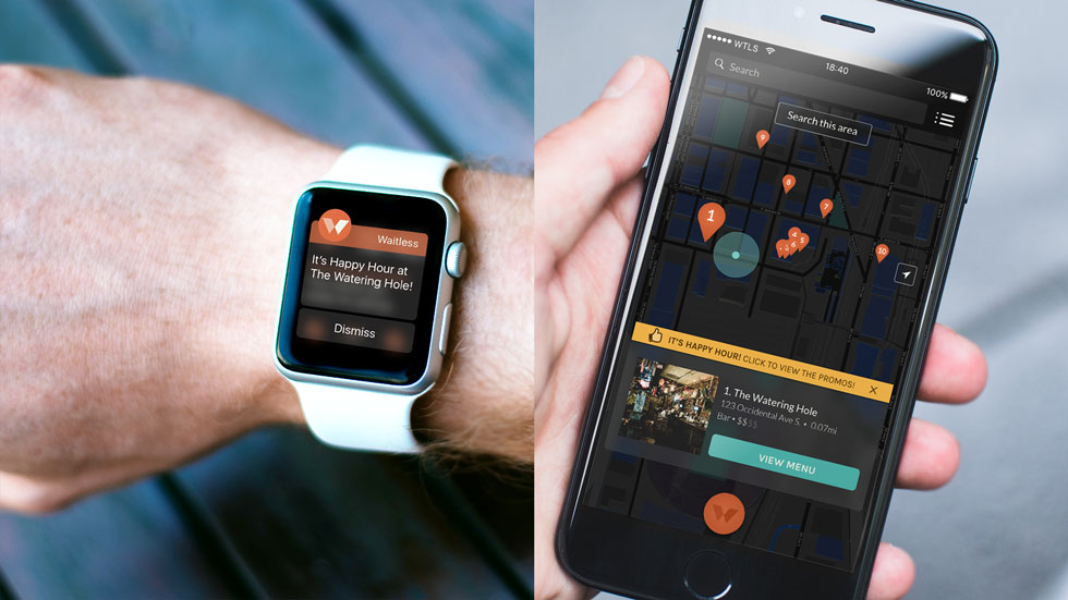
I adhered to Apple’s Human Interface Guidelines and principles to design the watch app. I also conducted user interviews of Apple watch users to get an understanding of how they used the watch. Watch users utilized their wearable most frequently for notifications and quick access to data. I used this information to create the following screens:
 s
s
Prototype and More User Testing
I created the prototype and wrote a script for user testing (Final Usability Test Script ↗). The script focused on venue discovery, drink order, and tab closeout.
A benefit of engaging users early and often was that I was able to tease out most of the issues and confusions before testing the prototype. However, this round of user testing uncovered issues concerning the copy, particularly within notification messages and CTAs (Call To Action) in the closeout screens. During and after tests, users suggested alternative words and phrases that would better help them understand what was being asked of them. I received satisfactory test results after incorporating these changes.
 Closeout notification screen alerting user of unassigned friends. (from left): lo-fi wireframe, hi-fi mockup (original), hi-fi mockup (final iteration).
Conclusion
This project taught me to:
- Build a list of terms and determine usage. In this project, I was confusing users by using several forms of ‘bill’ and ‘friends’ freely throughout the app. Terms like these should be defined earlier in a project to reduce confusion in later stages and in testing.
- Save some suggestions for future releases. Users will always have ideas for additional features. At times, I found myself exploring ways to incorporate these nice-to-have features and losing sight of the project goals. If I hadn't established goals at earlier stages of the project, I wouldn't have them to reference back to and could easily have been designing forever. Instead, I learned that it’s better to keep the product lightweight, get something out there, and work these nice-to-have features into a future release.
- Treat the users as the experts.During tests, users brought up some interesting scenarios I hadn’t yet thought of (ex. What happens if I want to create additional orders before I’ve received my first order?). I didn’t have an answer. So I asked the user what they thought would happen and they provided an amazing solution. “Two orders max at any time.”
- If possible, test, test and test some more. I used usertesting.com for my user tests because it allowed me to instantly test my design through the Invision-Usertesting partnership. However, when users became stumped by a question or confused by the limitations of the unfinished prototype, I was unable to provide them alternative tasks, without skewing results, to salvage the remainder of their test time. I also used actual kidney patients and medical health care professionals for testing.
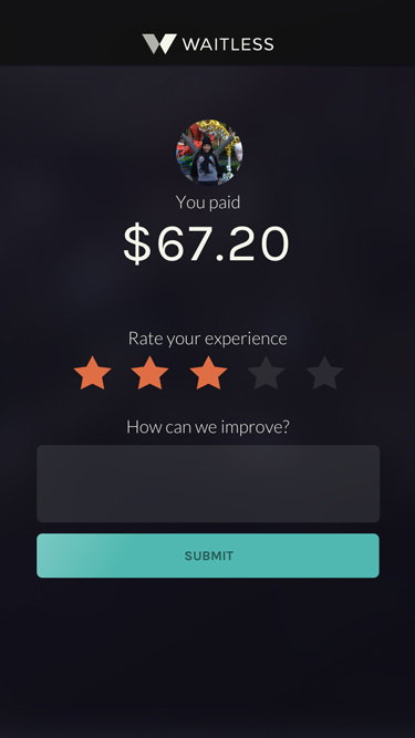
- Request feedback for future development. DuI was thinking of the nice-to-have features and wondered if I might be missing other ‘essential’ features that could be first added into future designs. I learned that the best apps don’t leave this to chance and will add a screen to the end of transactions to ask for feedback. By doing this, the brand and application are better prepared to continue prioritizing feature lists to give users what they want, when they want it.
 Thank You!