THE PROCESS
1
Research
For the research phase of the project I used the following methods: Usability Tests, Depth Interviews and Online Surveys
In order to gather insight I chose to conduct generative research with the goal of stepping into transplant patients’ shoes, to understand their lives and solve problems from their perspectives.
A series of interviews with patients and subject matter experts (transplant surgeons, nurses) and a review of current research on medical adherence.
My next step was to transform the research findings into meaningful and actionable insights. I organized several ideation sessions with the team and stakeholders to make sense of what we learned and come up with some ideas of what we should build to help transplant patients better stick to their medication regimen and keep learning ways to improve and stay in touch with their care team.
- What are the conditions that the design must satisfy to solve patients problem?
- What should we build and how should it work?
- Why should people care?
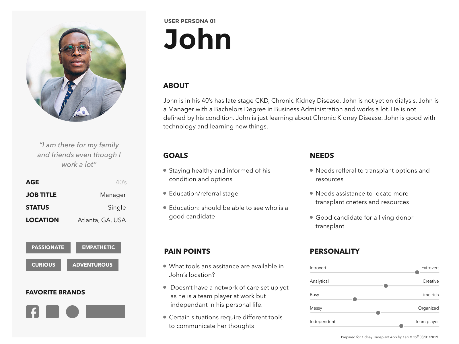 User personas reflecting the data from the research 01
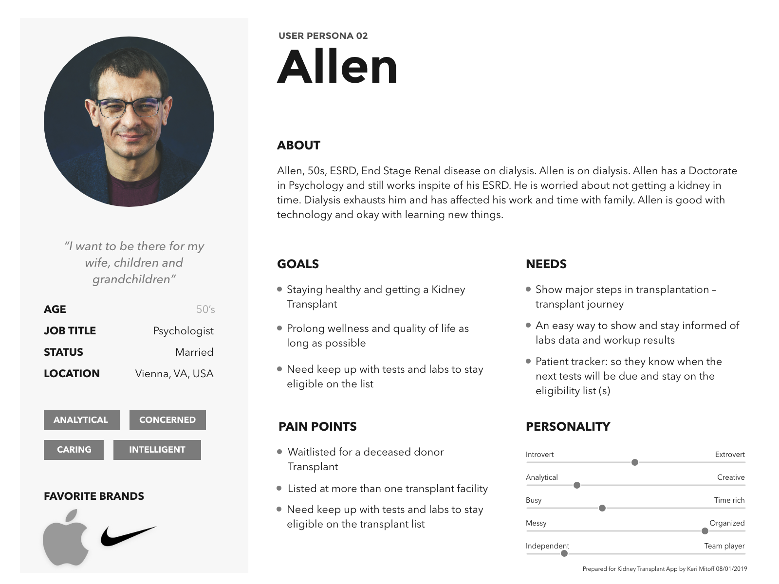 User personas reflecting the data from the research 02
THE PROCESS
2
Analysis - Features
Through the research methods, I acquired a large amount of raw data - both quantitative and qualitative. The goal of the research had been to identify the problems a kidney app should be solving for users.
The following features would be implemented into the mobile app:
- Easy sign-on and login
- Watch webinars, get handouts, ask questions through video
- See daily, weekly and monthly to-do list and check off things as you go as well as tracking progress
- Get reminders about upcoming appointments
- Patient will be able to see a list of my transplant evaluation test names, when they were performed and when they will be due next
The Process
3
Design
My design process would include User Stories and a Flow Diagram
User User Stories
Based on the motivations in my user stories, I generated a list of user personas to help define the main tasks of users
I then created user flows in Sketch to break down the complex user stories and visualize the paths of action users take to achieve their goals.
This stage of the design process was critical in identifying the areas of cognitive overload and redundancies.
User Flow - Navigation
Next step in my design process was to define the navigation style that I thought would accommodate the users flow through the app. Here I could call upon my earlier research and mobile app experience.
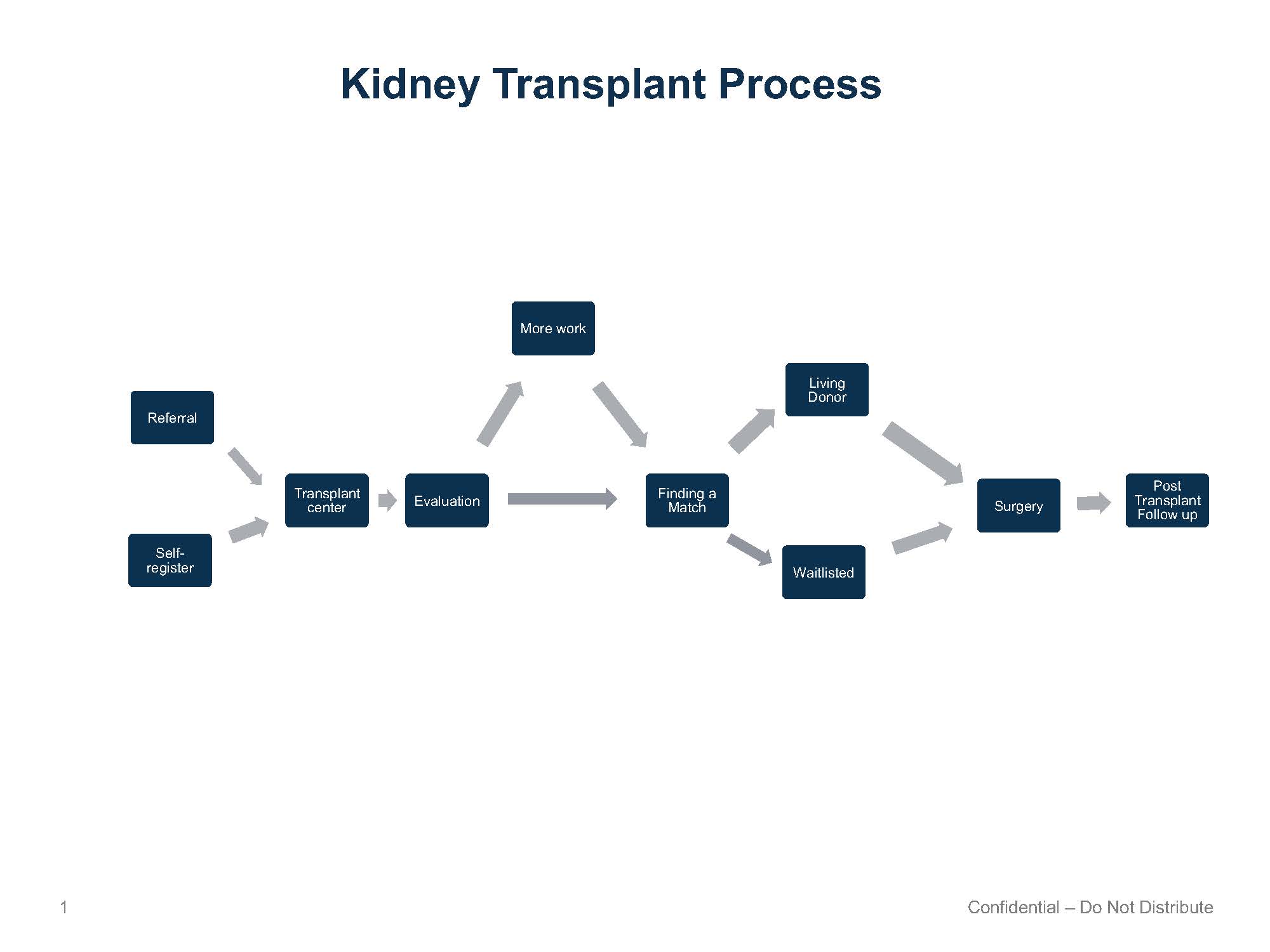
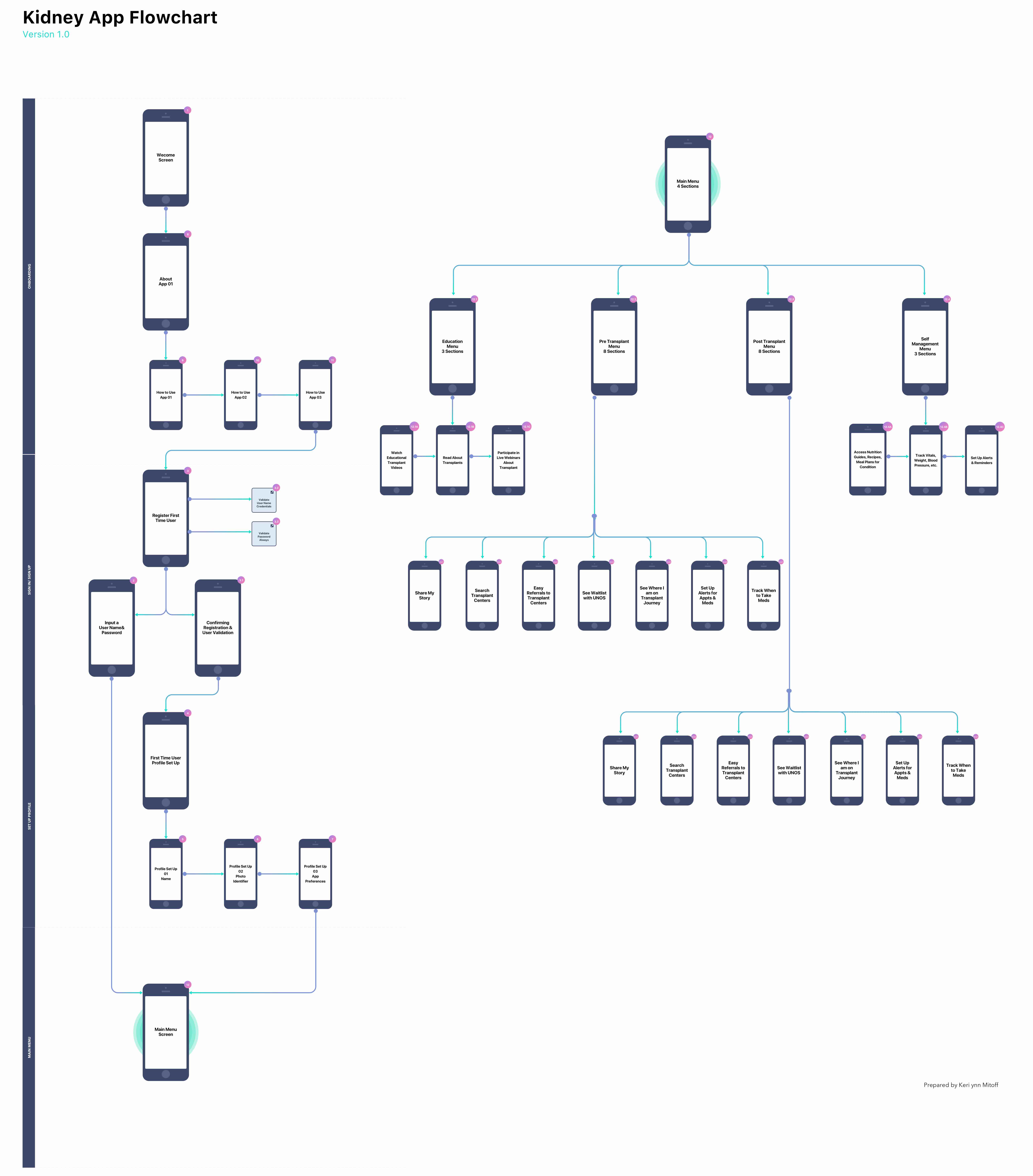 User Flow Diagram - Navigation
THE PROCESS
4
Prototype
For this project, I was asked to do wireframes in Powerpoint which was a first.
In creating my wireframes, I focused on reducing confusion of the entire application, balancing the amount of content, visual balance, and user-friendly UI. To reach these goals, I stripped away extraneous features users were less interested in.
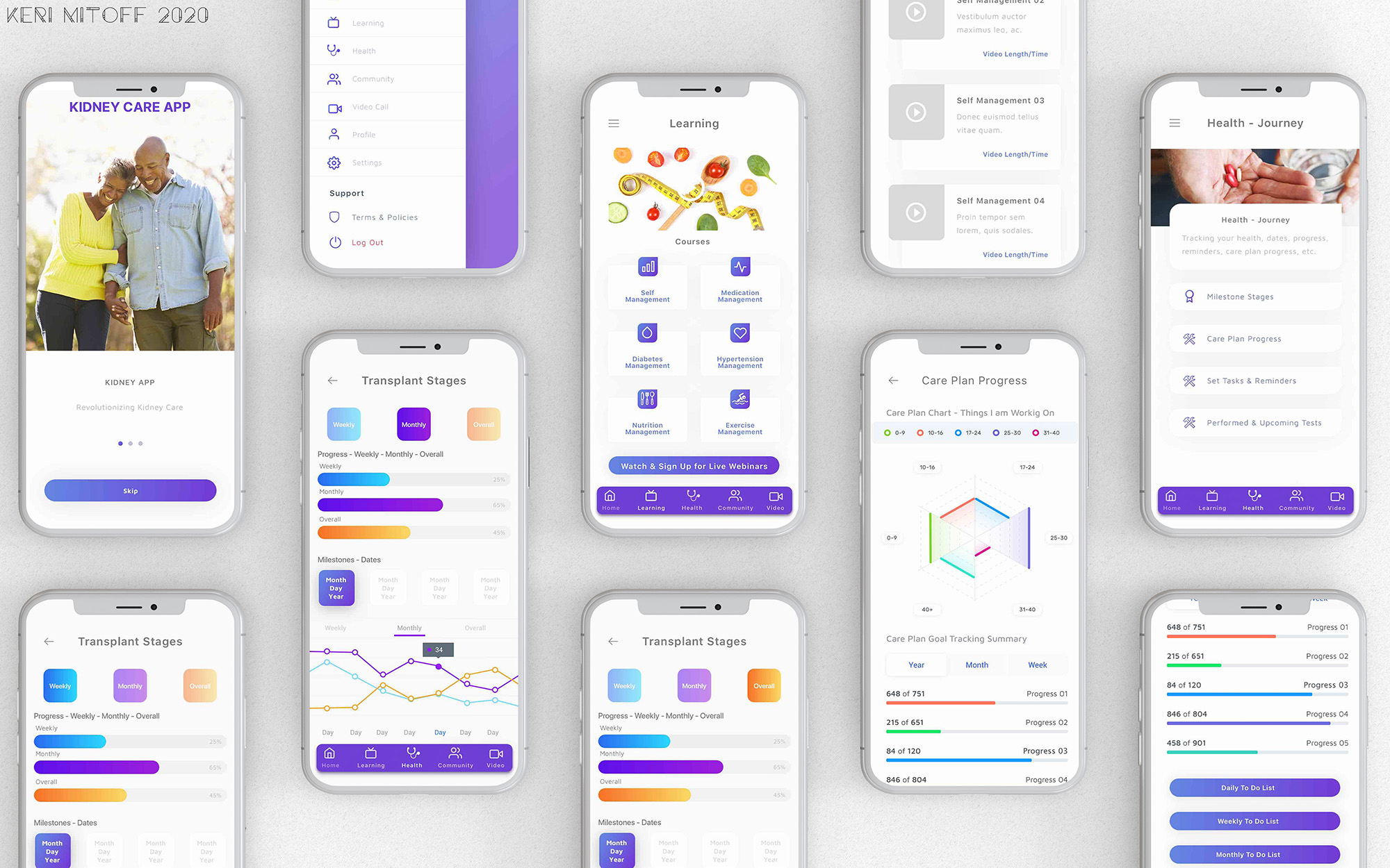
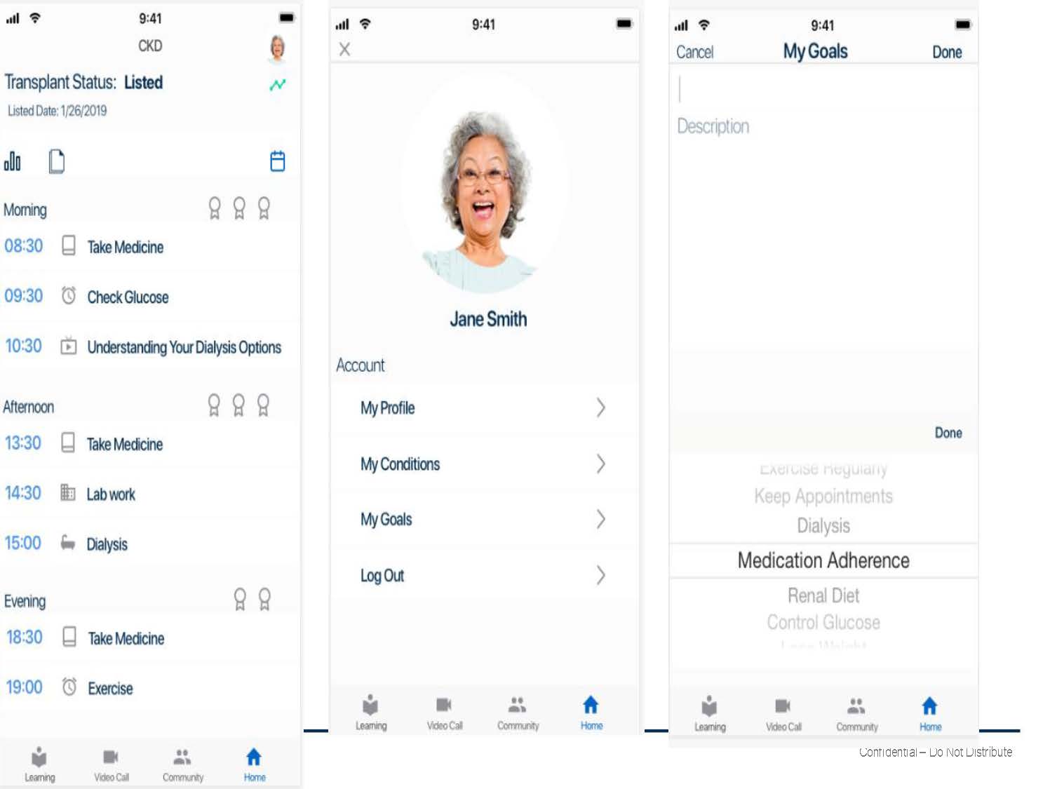 Prototype 01
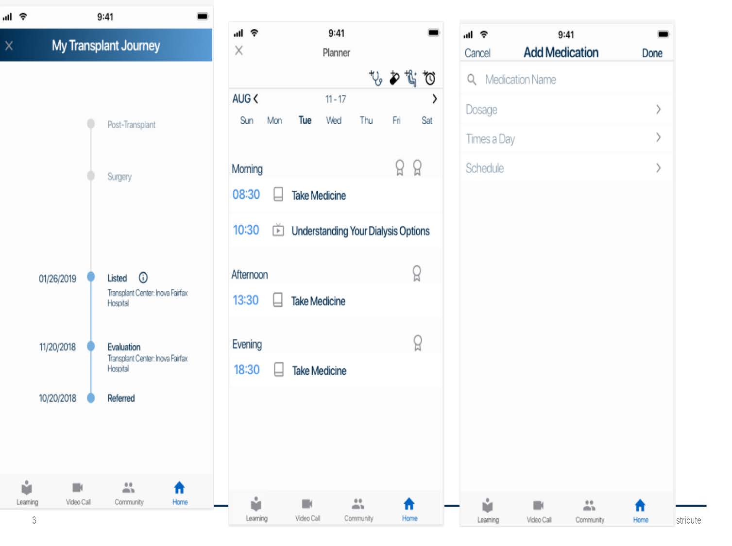 Prototype 02
THE PROCESS
5
Final Product
I created an interactive prototype with Sketch and animated it with Adobe XD and wrote a script for user stories. The script focused on directing the new and returning users through customization and the purchasing funnel of their finished product.
The results from the first round of user testing showed that users were overwhelmed by the number of screens. I noticed that the app was diverging from familiar mobile applications. So I added a first-time user onboard process that highlighted the application process and key features.
With the help of additional testing, I was able to condense the onboarding process to a few screens. Users found this onboarding process to be, in their words, “self-explanatory” and “easy-to-understand.” Most importantly, the addition reduced the confusion and led to more users using the application.
Conclusion
This project taught me to:
- Outline a project roadmap factoring in at least 20 percent additional time. My project roadmap accounted for the minimum but I exceeded that. Incorporating user feedback into wireframes took more time than I’d accounted for, specifically in the manner and stage I conducted my tests. I realized that this pace can affect other teammates and so it needs to be scoped accurately and delays acknowledged immediately.
- Test early and test often! I user-tested designs at the hi-fi stage as I have had difficulty with clients that do not understand wireframes typically have NO design elements. In an agile project, where the product needs to be pushed to market quickly, missteps would create delays and work against the overall budget.
- See daily, weekly and monthly to-do list and check off things as you go as well as tracking progress.
- Review the usability script before sending it into the wild. If it doesn’t make sense, the design could be great, but the user won’t understand what is being asked of them. This happened with my first round of user tests. In the future, I’ll be proofreading my script with others (team members, confidants, etc.) to find discrepancies.
- If possible, test, test and test some more. I used usertesting.com for my user tests because it allowed me to instantly test my design through the Invision-Usertesting partnership. However, when users became stumped by a question or confused by the limitations of the unfinished prototype, I was unable to provide them alternative tasks, without skewing results, to salvage the remainder of their test time. I also used actual kidney patients and medical health care professionals for testing.
- Discovery is natural. During usability testing, I found out what didn’t work. But I also noticed how users navigated through the app. Designers need to take these risks when designing key features. I learned to explain these unfamiliar design features in a manner that is simplistic and unobtrusive to overall experience and always include a back / exit action with older kidney patients and medical health care professionals unfamiliar with mobile applications.